Poster Contests
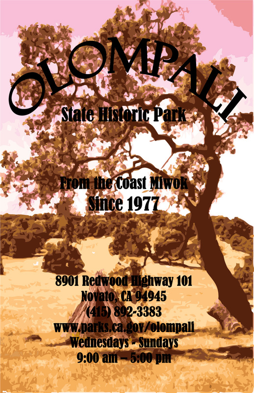
I Photoshopped the little hut into the picture and then used the whole picture together in Photoshop and used different effects and ended up with a sunset color which I then copied back to Adobe Illustrator and added the text in bold because it was hard to read in any other font.
Poster Presentation
Newspaper
This is the website I used:
http://www.smashingmagazine.com/2010/01/28/color-theory-for-designers-part-1-the-meaning-of-color/ |

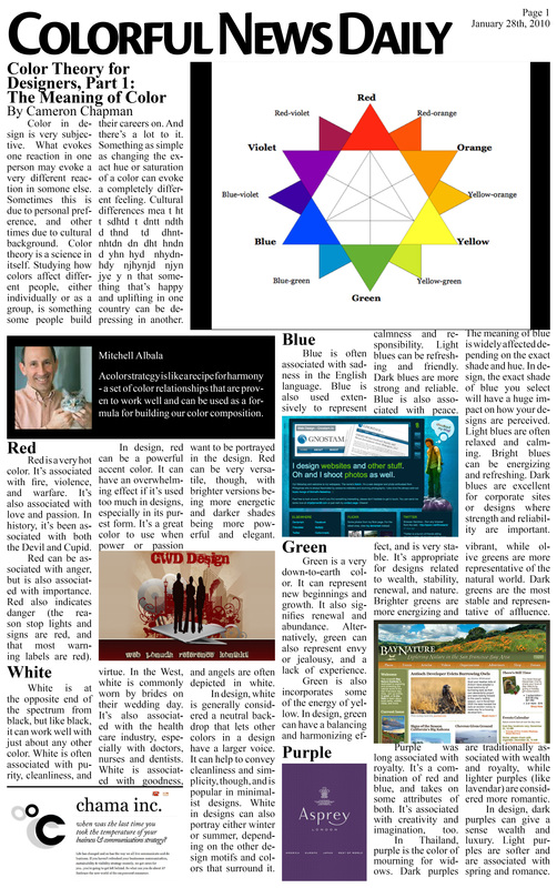
I used the same font for the text and the same font for all the sub titles. I tried to give each article the same amount of space, or just the space they needed. I also added an example of each color and added a color wheel to help the audience visualize. I made the Title big and bold. I didn't add color because I wanted to keep it simple. I thought that if i made the title a color too, the whole page would be to distracting. I also tried to not put pictures too close to each other to avoid confusion. And same for the text. I didn't want to make it to hard to read.
|
Magazine Covers I Like
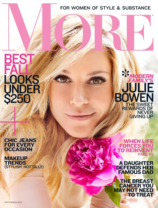
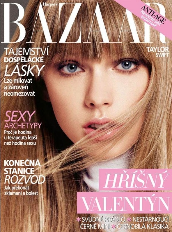
I like how all the text is legible, and clear. The magazine decided to stick with warm colors, and more so pink. The colors compliment her face in which they don't make her skin color change. The title also isn't behind her so I know what magazine it is.
|
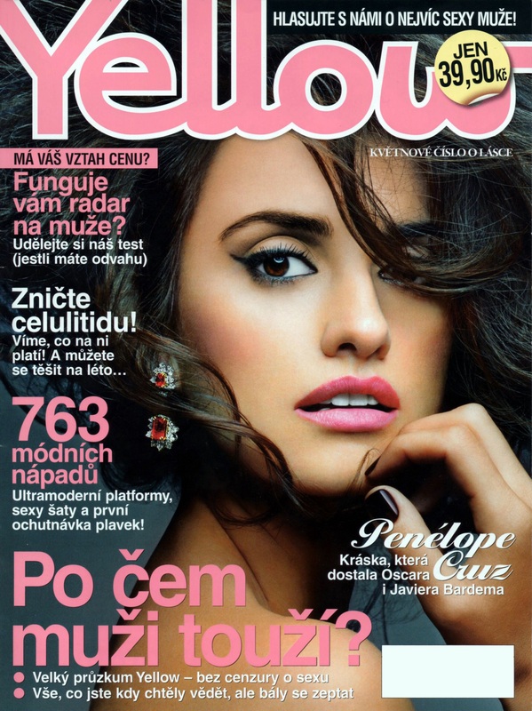
Despite that the magazine is in another language, I like how the text goes around her face which makes you either focus on her face or the text. But not at the same time. Its a good mix between to much and not enough. Its just right how they alined the text.
|
This magazine is also in a different language, but the colors they picked were really good choices. Instead of black text they choose white, but it's not hard to read so that's really nice. Even with really thin text (and not bold) its not hard to read.
|
My Magazine Cover
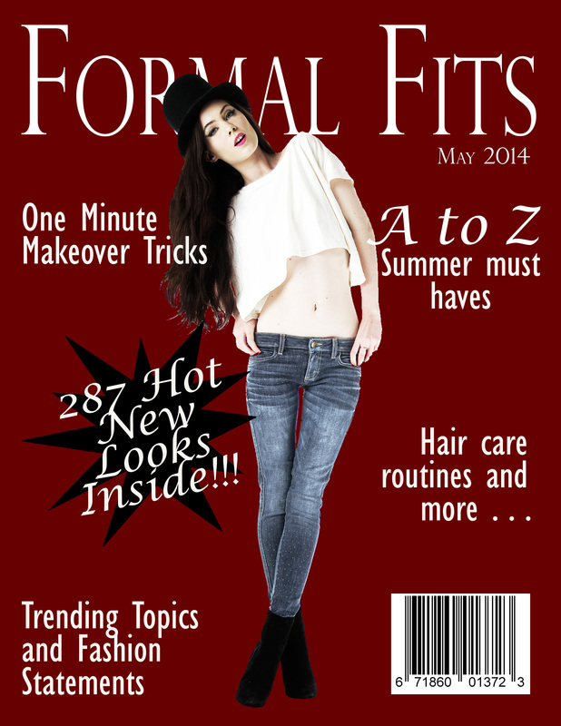
I used a high resolution image of a model to place on the center of my magazine cover. I used a whitish color for the font to match the color of the girls skin. I used the black star to emphasize the ad. I spaced the ads apart so you could tell them apart and also to give each ones its own unique area.
DPS Magazine Page
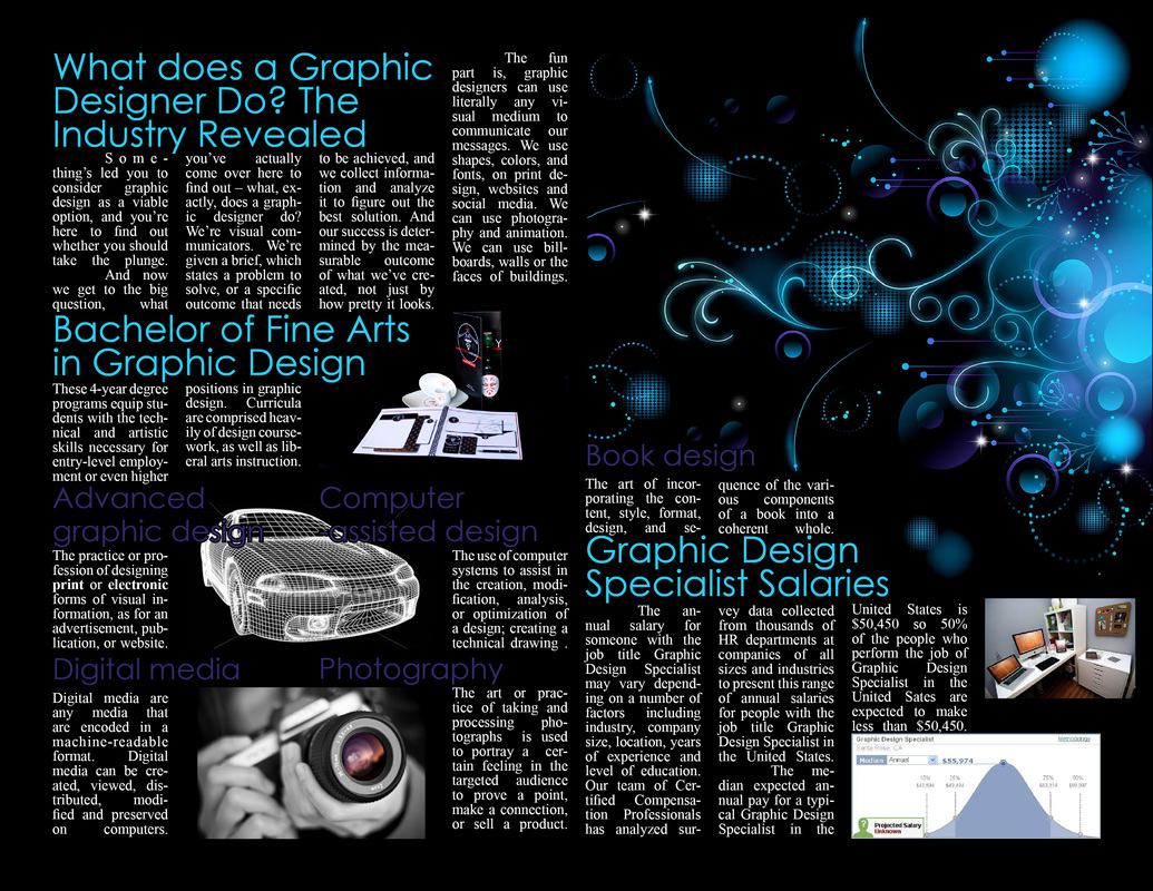
I used In Design to create this 2 page spread. I used most of the info from the same informative page and separated them into smaller articles. I added pictures that I thought were appropriate for some article context. I also made the background black to match the example of graphic design art on the top right and also alined the font to not make it look awkward. I also used similar colors from the picture and used it for the article titles. I didn't want the titles to have different colors that didn't match the 2 page spread theme colors.
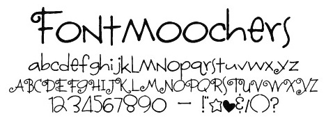
5 Favorite Fonts
Janda Curlygirl Serif

|
Fontmoochers
|
Handwriting Draft

|
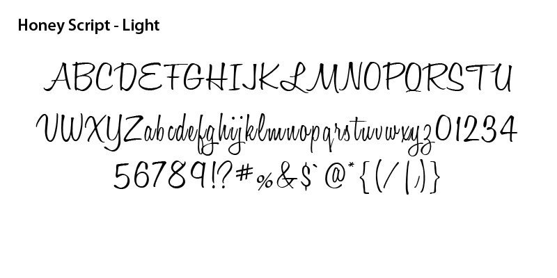
Honey Script Light
|
Beyond Wonderland

|
