3D Imagination Drawing

|
For the 3D imagination drawing I used a lot of cylinders and spheres. I made the cylinders by placing ovals at the top and bottom of rectangles by using the shape tool. I then used the gradation toot to give the shapes a three dimensional look. The spheres were just circles that I also used the gradation tool. I tried to place all the shapes spread out so they wouldn't over power a certain spot in the picture. Also for some of the objects I also created a shadow to show were the light source was. Another thing I used that was very useful was layers. I locked the background so I could place and move the shapes with ease. Lastly I added really small stars to the top portion of the drawing because it was really plain and i wanted it to look like a sky and not just a rainbow. |
History Presentation: The Bauhaus
T-Shirt Design: Touche
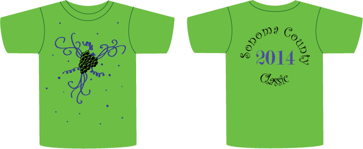
For our first T-Shirt design we were supposed to make a design for Touche. They wanted a nice green colored t-shirt so I tried to make a guess on what color green they would like. Then I had the option to choose a 2 color design. I chose a more neutral color as black and a color that would stand out in front of the green, blue. I used layers to lock the T-Shirts in the background to place the lettering and design s with more ease. They wanted a vineyard design so I used the shape tool to make a bunch of different shaped circles to make the grapes and then used the pen tool to create a crescent shape so there would be a light source and also give it form so it wouldn't just look like a big blob of circles. Then by using the paintbrush tool I created the vines around the grapes to add some contour. And lastly I added the other small dots with the shape tool to fill in the empty space and seem like they are even falling grapes.
Milton Glaser
|
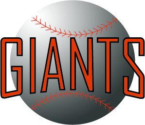
Giants Logo
|
For the Giants Logo I followed the directions that were given to us. First wrote out the name of the teem and chose the font i wanted and then selected the words. I separated them and made them their own individual object. Then I used the shape tool to make an oval bellow ill the letters and tried to center it. I dragged the bottom of the
|
|
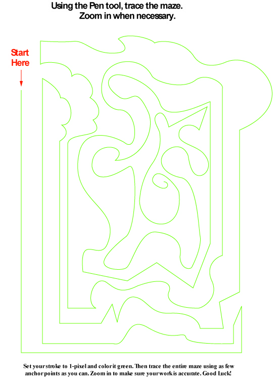
Pen Quiz
|
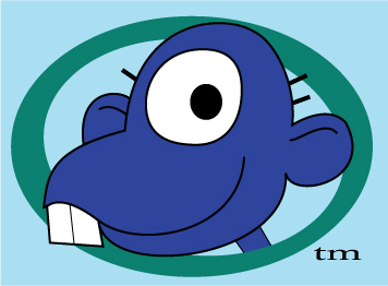
Monkey Remake in Color
|
For the Monkey Remake I used a lot of layers. I used a layer for almost all the parts of the monkey I made. I made the background and the two circles as one simple layer and locked it to make it easier to place the shapes above. Then I moved them to trace the monkeys face with the pen tool, that was its own layer. Then I added to that layer all the details of the face like the eye and hairs and the contrast line in its ears. During this process I have been changing the colors and overlaying the layers. Finally. I tried to look for a font that looked similar and squished it to make it the same.
|
|
Casa Grande T-Shirt
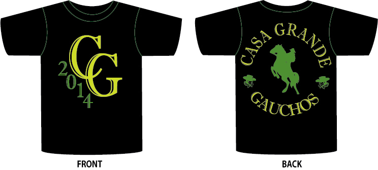
For the Casa Grande T-Shirts I tried to stick to the original look so people can still recognize the school. I triesd to keep it basic and clean. I curved the words to make it look like a circle and then place a gaucho on a horse in the center
