"What is Typography" Project
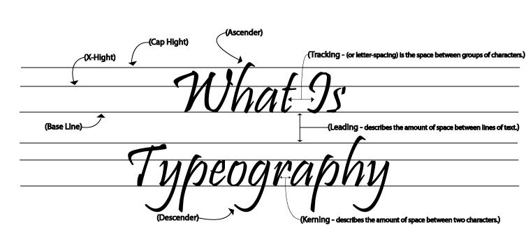
For our What is Typography Project we learned how to use the pen to create neat straight lines by making a dot and then pressing the shit key and placing another dot, and how to gradually move the lines to be able to aline them perfectly with the words. We learned vocabulary such as Tracking, Leading, and Kerning. We also learned to use the pen to create the arrows that lead to an example of the vocabulary word they are pointing from.
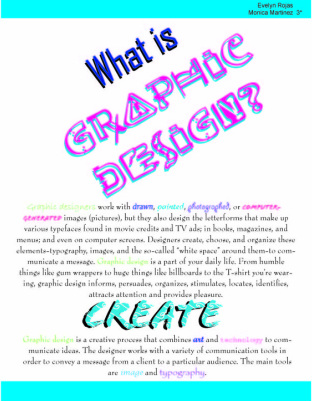
Flyer Project
|
In this flyer we learned how to use the rotating tool to change the way you saw the title. My partner and I tried to stay with a similar color scheme so we didn't overwhelm the flyer with a wide range of colors. We stuck with warm lively colors that ranged from blues to pinks. We used the shape tool to create bars at the top and the bottom and also changed the font and color for the words we believed were significant. We also layered the title and "create" to make them more dramatic by placing them over the same exact word but in different color to make the effect of a shadow.
|
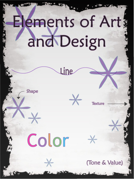
Elements Flyer
|
For the elements of art and design flyer I downloaded the boarder from the internet and placed it as the background. I then placed a layer on top of that and gave it tone and value by making the top of the flyer darker than the bottom. Te help with this effect I made the Tittle completely visible and as you move down the page, the rest of the objects also begin to fade. I primarily used the flowers I made to show the change in value so it wouldn't take away from being able to read the words. The flowers I made by making a hexagon and then using another tool to squeeze the object, making a flower like shape. I used the line tool to make a curved line and changed to color of it. The background was used as my texture. Since I tried to stay in a dark color scheme I made the word "color" in actual different colors. And lastly, I used the whole flyer as an example of tone and value.
|
|
Logo Remake

The 5 logos that are at the top were the 5 logos I chose from the internet. I decided to re-do the LG logo first. I made a circle and then just used the pen tool to make the inside of the face and then tried to use a similar font to match the LG letters. I thought it would be hard but ended up to be really easy so I then chose to do the Olympics logo. For this logo I made the 5 circles and then added white strips with the pen tool to create the overlap effect which was a lot harder. For both logos I tried to match the colors as close as possible by using the tool.
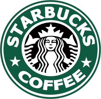
Starbucks Coffee Logo
The whole logo was a puzzle for me as we had to individually make all the pieces of the logo with the pen tool. I also used a lot of layers to over lap the circles which i was able to center by using the smart guild and holding the shift and alt buttons when I click and drag on the center. The stars were made by the shape tool and used the same method when I copied them from the original logo.
|
|
